
B2B SaaS for Security Firms
Document storage, e-signature, and audit-ready compliance
My Role
UX/UI Designer & Researcher
Led the market research, information architecture, and high-fidelity prototype end-to-end. Partnered with a teammate on personas and wireframing.
The Team
Ana Margarita Cardenes — Market Research, Information Architecture, High-Fidelity Prototyping
Mario Pinardi — Personas, Wireframing
Timeline & Context
12 weeks · Delivered December 2025
Master's Capstone, Northeastern University
Real startup engagement
The Context
Security and alarm-monitoring firms currently manage hundreds of high-stakes contracts using fragmented, generic tools—creating compliance risk and blocking access to lender financing. We partnered with Loyva, a Texas-based startup, to design the industry's first purpose-built ecosystem: a single source of truth that turns document chaos into a scalable, audit-ready business asset.
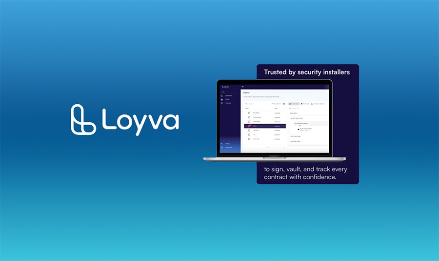 0.0 Dashboard Concept: Centralizing complex security operations in one interface.
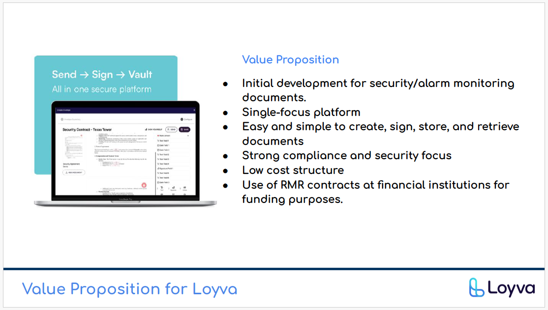 0.1 Core Value Proposition: Efficiency, Compliance, and Growth—the three pillars that shaped every design decision.
A B2B SaaS designed for the speed of a scaling security firm.
From 10-hour weekly filing to zero-friction workflow.
Working closely with Loyva's founders, we turned a punishing weekly filing burden into a workflow that runs in the background. I designed the flow for creation, e-signing, and vaulting so retrieving a critical document takes seconds, not hours.
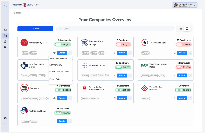 1.1 B2B Client Card View: Quick-glance status.
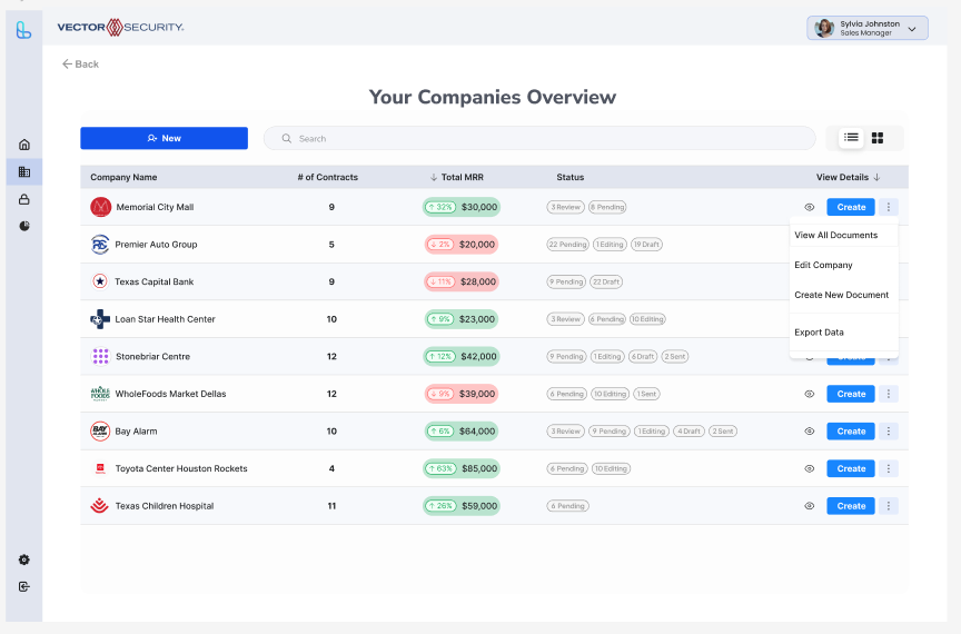 1.2 B2B Client List View: For scanning across a portfolio.
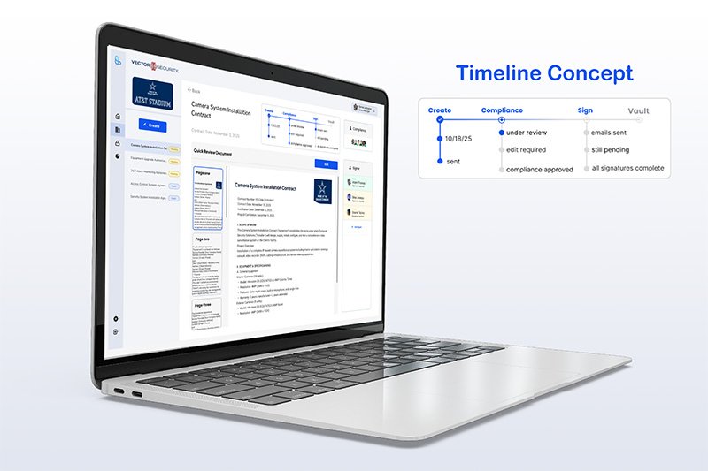 1.3 Intelligent Tracking: Mapping the end-to-end signing timeline.
Centralized Creation & Management
I simplified the workflow so users are always one click away from drafting, sending, or signing a high-stakes agreement.
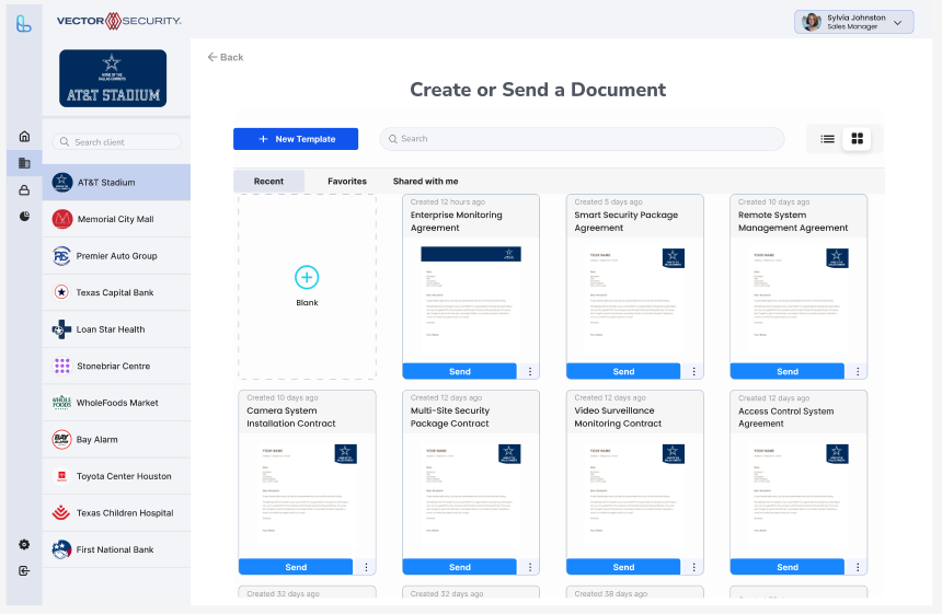 1.4 Global Search: Instant retrieval of any contract across the database.
Audit-Ready Asset Vaulting
I designed The Vault so original documentation stays secure, encrypted, and immediately accessible for lender audits—the compliance layer competitors treat as an afterthought.
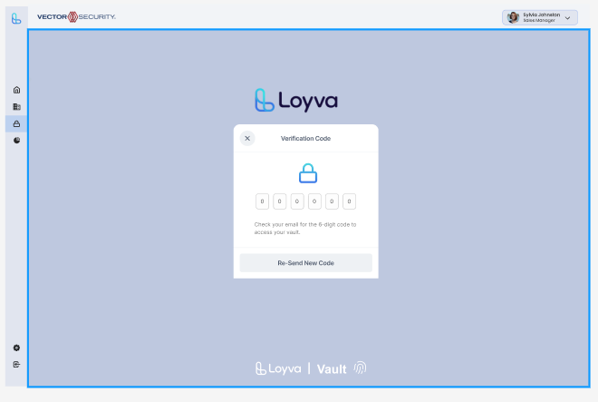 1.5 The Vault: Protecting original assets with bank-grade security.
A massive, underserved market ready for a specialized solution.
Before design, I sized the opportunity. I sourced IBISWorld data, analyzed the U.S. and Texas markets, mapped competitors, and modeled a 5-year growth projection—all to answer one question: why has an entire industry been left to generalist e-signature tools?
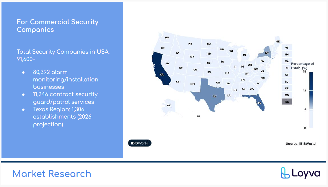 2.0 U.S. Market Landscape (IBISWorld data).
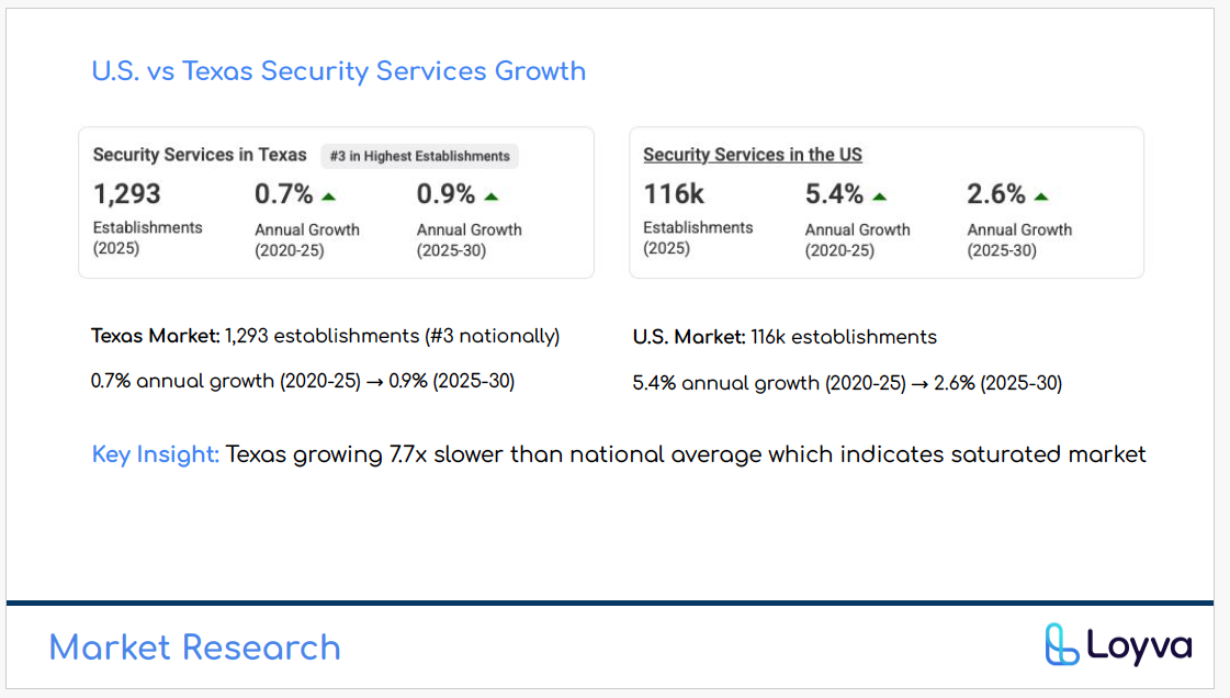 2.1 Texas Market Opportunity—Loyva's launch region.
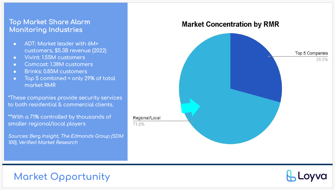 2.2 Pinpoint Market Opportunity within security & alarm monitoring.
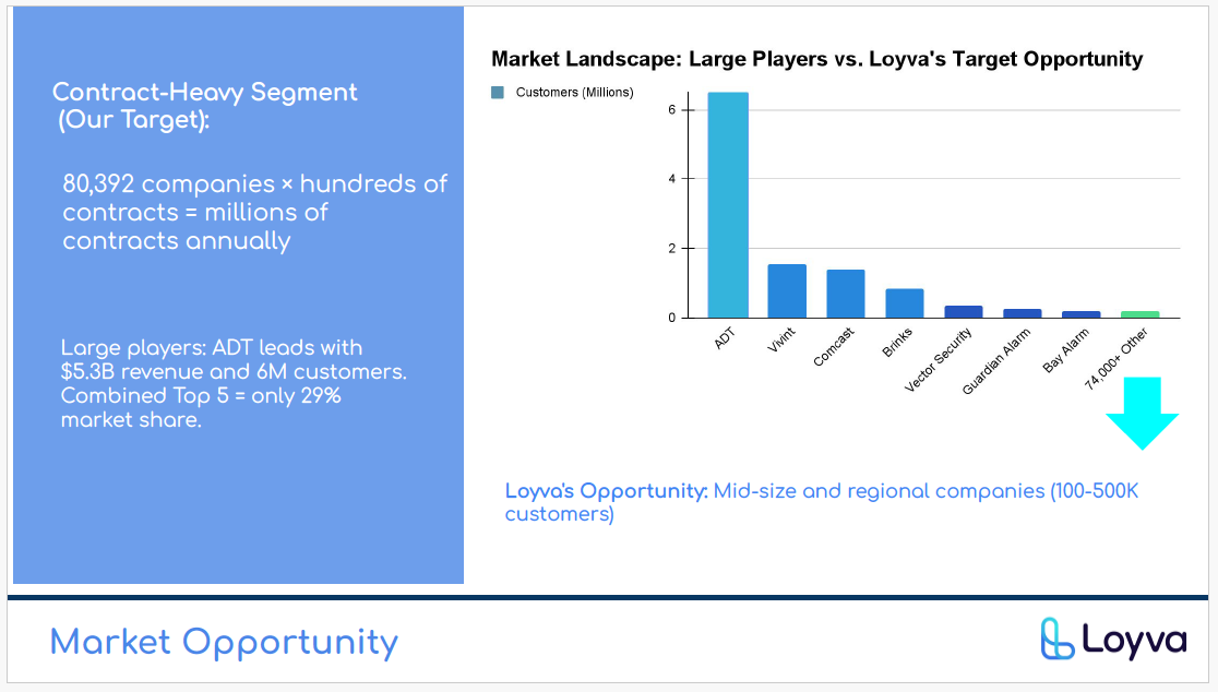 2.3 Target Customer Landscape.
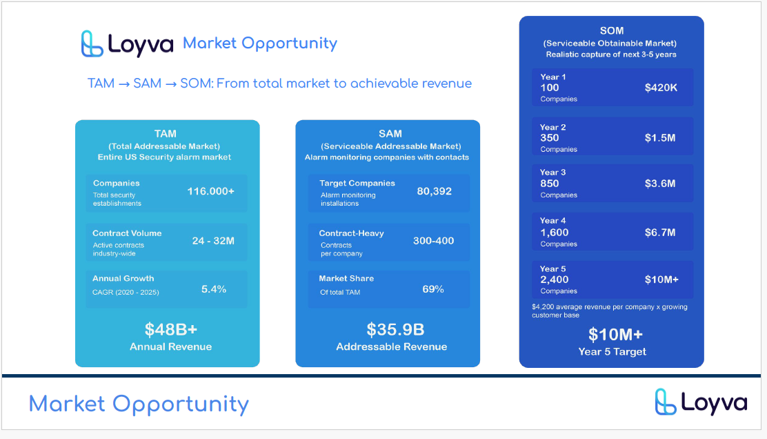 2.4 5-Year Revenue Growth Projection.
Why generic tools fall short for security firms.
The market is vast, but currently served by generalists. Where competitors focus on the act of signing, Loyva fills the gap that opens up after the signature—managing the compliance lifecycle where audit risk actually lives.
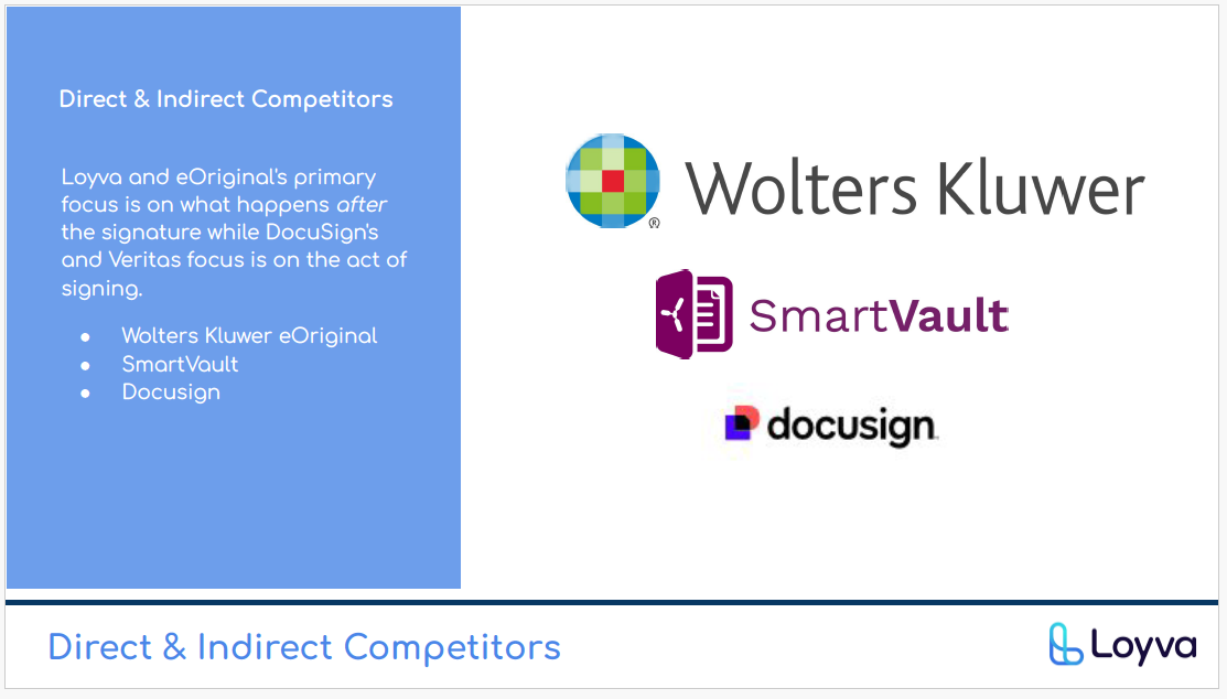 2.5 Direct vs. Indirect Competitors—the white space is real.
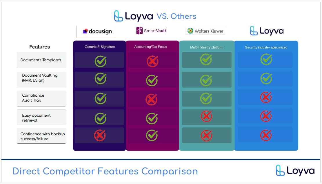 2.6 Feature Comparison: Specialized compliance features vs. generic e-sign.
Security firms are drowning in document silos and generic tools.
The Impact: Firms waste hours weekly navigating between systems, losing audit trails and taking on serious regulatory risk.
The Gap: No unified, compliant repository handles the entire contract lifecycle in one place.
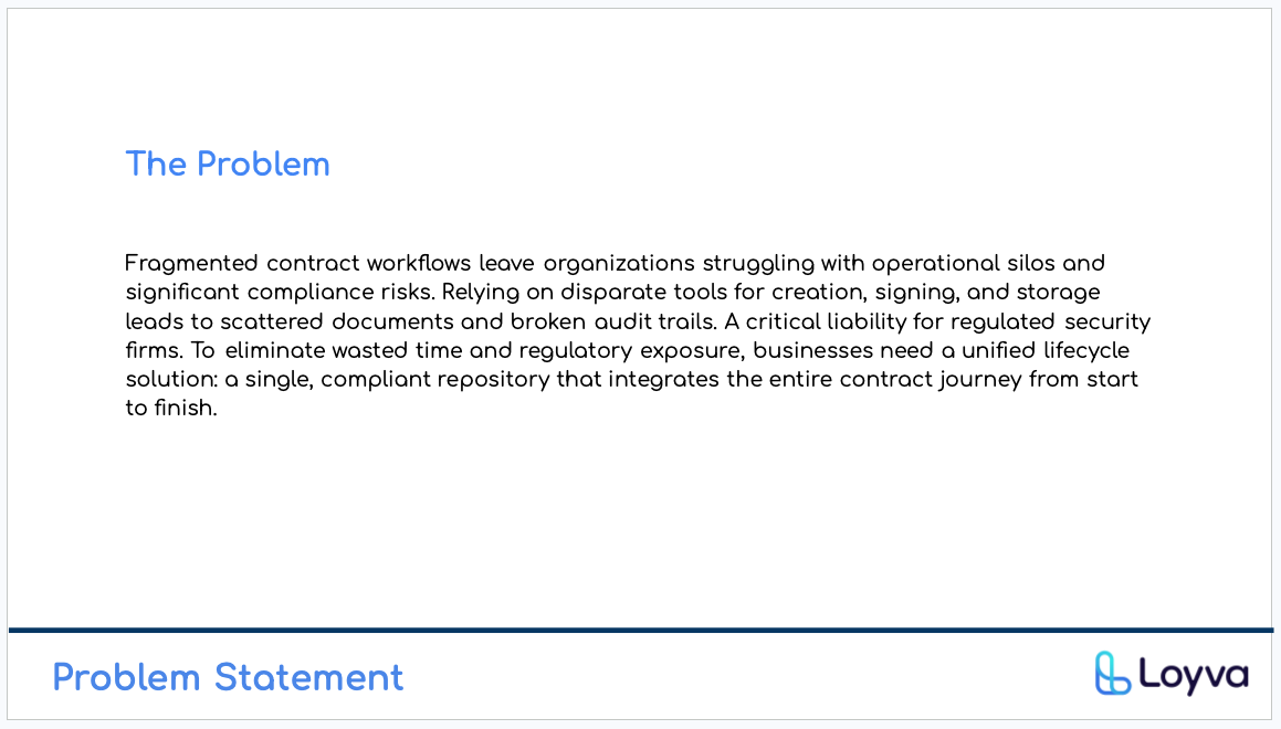 3.0 Problem Statement
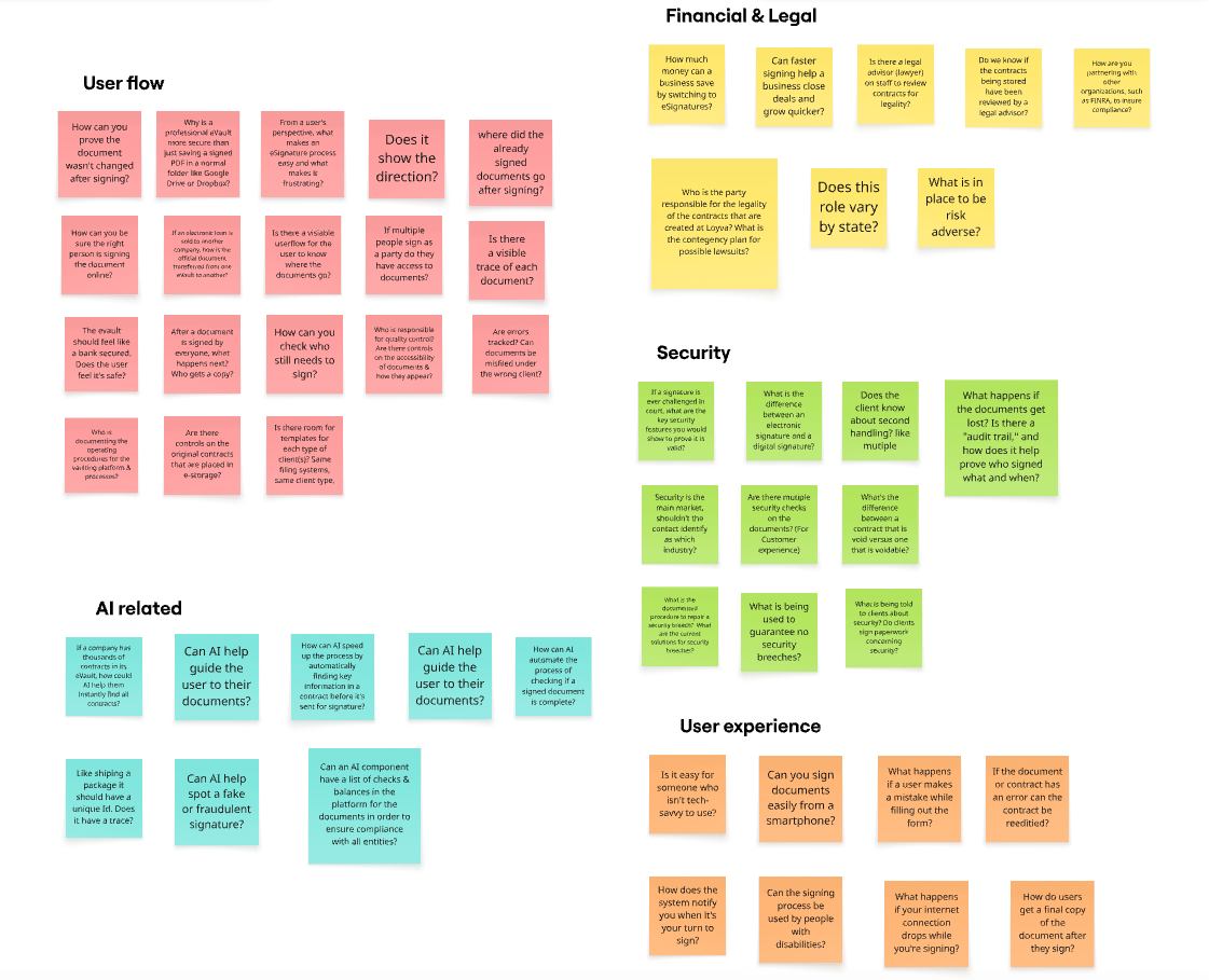 3.1 Card Sorting—defining what "compliance" actually means to the user.
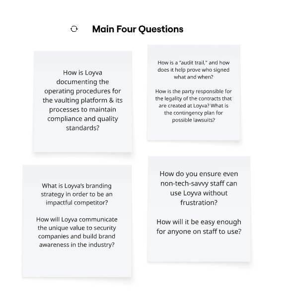 3.2 Problem Architecture Formulation.
Designing for the person carrying the risk.
The team's research centered on "Mike"—a mid-size security firm owner representing our primary user archetype. Working from the persona and empathy map, I synthesized the insight that shaped every subsequent design decision: the shift from paper to digital isn't a technical problem, it's an emotional one rooted in compliance anxiety and operational overwhelm.
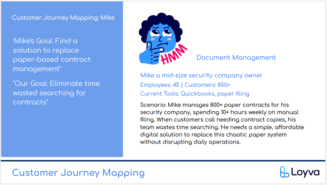 4.0 User Archetype: Mike, "The Strategist" Founder.
Mapping the internal and external struggle.
Understanding Mike's mindset was critical. He thinks about ROI and insurance savings, but he feels overwhelmed by 800+ paper contracts and the fear of lender rejection. The product had to speak to both.
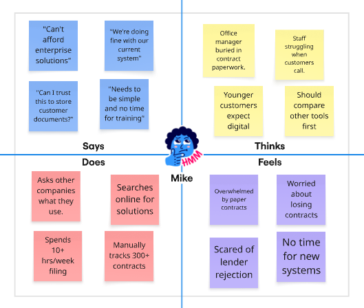 4.1 Empathy Map: Identifying the emotional hurdles of digital adoption.
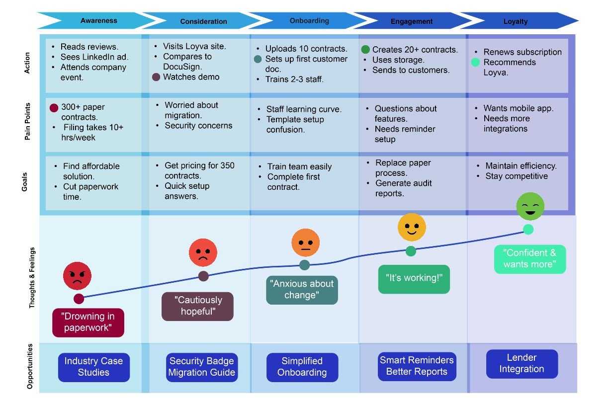 4.2 Customer Journey: From "drowning in paperwork" to "confident and growing."
Interview Highlight: Mike's biggest pain point was the 10+ hours spent weekly on manual filing. The solution had to be simple enough to adopt without disrupting daily operations—or he would never use it. Every subsequent design decision was measured against that bar.
Blueprinting a compliant, zero-friction ecosystem.
Before high-fidelity, I mapped the full contract lifecycle to ensure Mike could go from "Upload" to "Vaulted" in under three clicks. The goal, drawn straight from research: eliminate the 10-hour weekly filing burden.
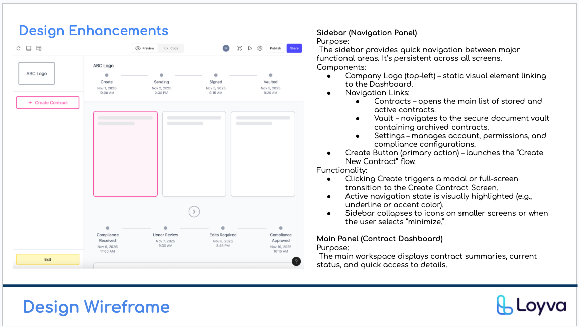 5.0 Logic Flow: Creation → Signing → Stakeholder Vault Distribution.
Bringing the vision to life.
The final MVP prototype focuses on three pillars pulled directly from research: speed of creation, unbreakable compliance, and instant retrieval.
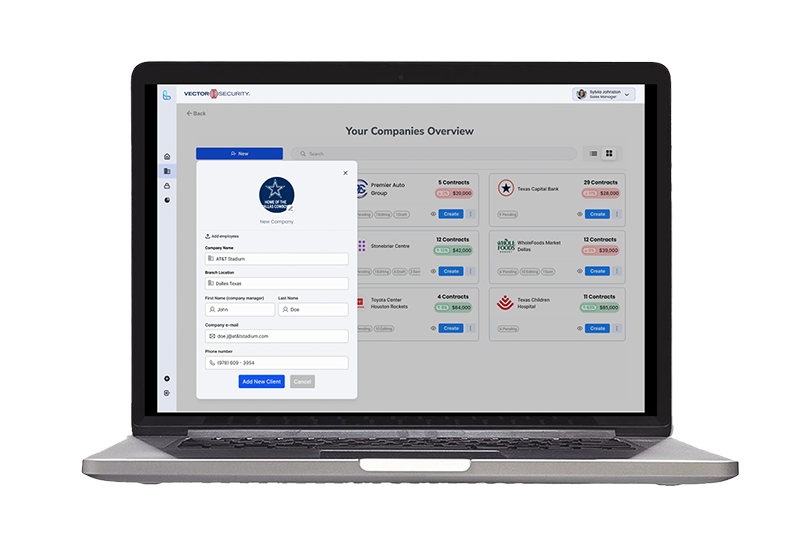 6.0 High-Fidelity MVP: The Vault and Dashboard interfaces.
Delivered to Loyva's founding team, December 2025.
A validated MVP prototype, a full research package, and a market analysis positioning Loyva to raise and build. Delivered as my master's capstone at Northeastern—real client, real deliverable, real feedback loop with founders.
- Interactive MVP prototype: A high-fidelity Figma prototype covering the full contract lifecycle—creation, signing, vaulting, retrieval—ready for founder pitches and dev handoff.
- Research-backed strategy: User archetype, empathy map, journey map, and interview synthesis grounding every design decision in the actual behavior of security firm owners.
- Original market analysis: TAM/SAM/SOM sizing, IBISWorld-sourced U.S. and Texas market data, 5-year growth projection, and competitor gap analysis—the strategic layer positioning Loyva for its first fundraise.
- Real founder partnership: Weekly check-ins with the Loyva founding team throughout the 12-week engagement—not a hypothetical brief, a live client with real stakes.
What this project shows
I can take a specialized B2B problem—one most designers wouldn't touch—and turn it into a research-grounded, defensible product design. I can work inside a small team, own the UX layer end-to-end, and deliver something a founding team can actually take forward. This is what an academically rigorous, client-facing engagement looks like when it's done right.

Skills Applied